Mercy Corps design system
This page contains the most common components used across our website. Its purpose is to help our colleagues and creative partners understand the options our design system has to offer. Additional components specific to Basic Pages can be found on the Basic Page Design System page. This page will be updated as new components are created.
Table of contents
Text layout options
Formatted text resizable
This is the most common text format across the site. You’ll find it in our blog articles, research articles, and many other pages.
Centered text
Centered text is less common. It’s used as a set up to other content on several landing pages. You can find examples of centered text on our partners page and careers page.
Left-aligned text
Left-aligned text is also less common. It’s used at the top of some pages to introduce the content on the page. You can find examples on the team page and petitions page.
Quick stats (must include 3-4 stats)
This is optional Eyebrow text
-
101
-
33k
-
2%
-
50+
Image options
Hero image
The hero image is featured at the top of the page, directly under the page title. You will find them on many pages across the site, including all of our blog articles, country pages, and focus area pages.
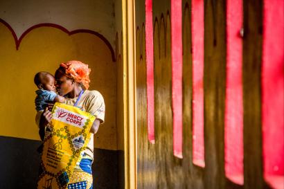
In addition to the hero image, we have a wide variety of image layout options to choose from on a page:



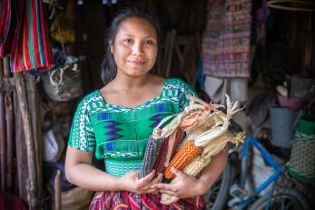
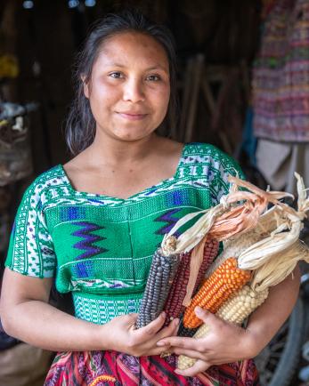


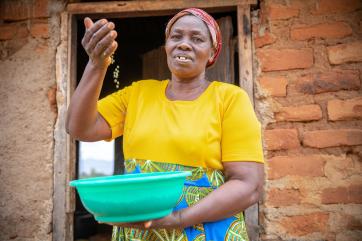


Enlarged quotes
Enlarged quotes are used to highlight a compelling quote from a voice in an article. They feature the name and title or location of the person, along with an optional photo of the person being quoted. Quotes should be no more than 84 characters, including spaces.
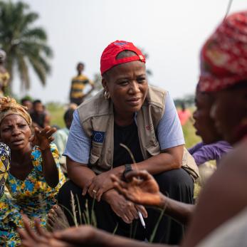
This is a compelling quote, including an image, from someone featured in an article.
Person's name, Their title or location
This is a compelling quote, without an image, from someone featured in an article.
Person's name, Their title or location
Video
Embedded videos can utilize a Youtube link, or preferrably, can be hosted directly within our website and look like this when embedded in a page.
Inline video
Inline video allows you to add a short looping video to a page. The video can begin playing automatically and will repeat when it ends. Mobile users will see an image which can be clicked to make the video start playing. The video window can be presented in small, large, or extra large. There is also an option for a caption. Videos do not automatically play unless the audio track is removed from the submitted video file.
CTA (call-to-action) units


Teaser copy that previews the content for the audience. Copy should be no more than 200 characters including spaces.

Teaser copy that previews the content for the audience. Copy should be no more than 200 characters including spaces.
We have the option to include looping video in order to give people a compelling peek into the content we're promoting.
Preview tiles
Preview tiles are used to provide previews into other pages. They can be in a set of 2 to 3, and can be stacked. You can find examples of preview tiles on our Policy and advocacy page.
Button boxes
Similar to Preview tiles, Button boxes are used to provide previews into other pages. They must be in a set of three. You can find examples of button boxes on our partners page and careers page.
Side-by-side

Logo grid
Logo grid allows you to build out a chart of icons that act as buttons to the URL of your choice. Best practice is to link the icon to the URL of the group or organization represented. This component is only available when building landing pages but not when building articles, resource pages, or research articles.
You can find examples of logo grid on our partners page and social ventures page.
Horizontal rule
A horizontal rule is a gray line that goes across the page and separates content. You can see usage of horizontal rules on our homepage and many other pages, including this one!
Person three column
This component enables us to feature people on pages. They must be in groups of three, and feature the names of the individuals. A secondary line is optional, and usually features the person’s title.
